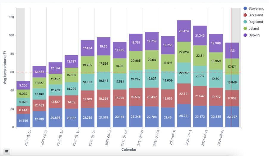
Line, Area, and Bar charts allow you to plot your data on the X/Y axis.
Prerequisites
To work with visualizations, make sure to
- Authorized access to the Klink lab
- Select the right tenant
Start with a common scenario: Top 5 cities with the highest weekly temperature over the last 90 days. In this example, we use a public data feed NETATMO
Instructions
Step 1: Open the visualization builder
- Go to Visualize on the left sidebar menu
- Click Create visualization
- Select Bar chart
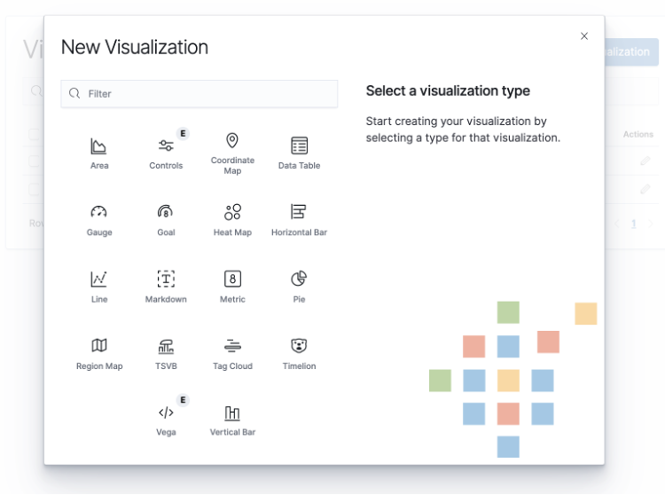
- Select Netatmo as the data source
Step 2: Choose Metrics and Buckets for the visualization
Bar, line, or area chart visualizations use metrics for the y-axis and buckets for the x-axis.
- Learn more about Metric and Bucket Aggregations
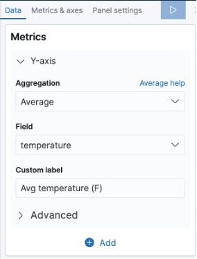
- For Y-axis, in the Metrics panel
|
|
|
- For X-axis, in Buckets panel
|
|
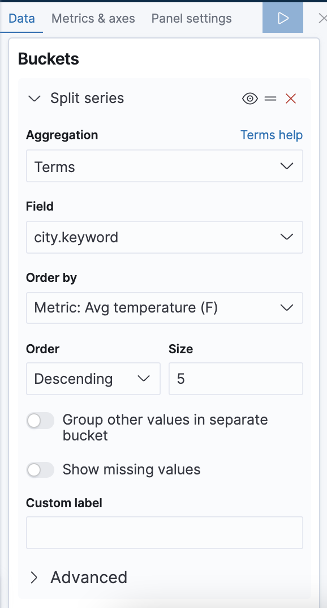
To retrieve the top 5 cities with the highest rainfall
|
|
|
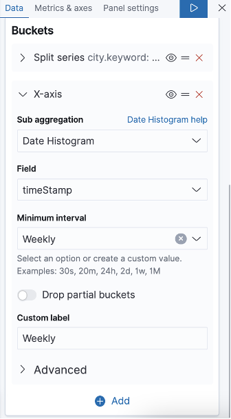
To present data weekly
|
- Click the arrow icon to apply change
Note: Drag the icon to change the priority of the bucket aggregations. Learn more about working with aggregation priority.
- Panel setting
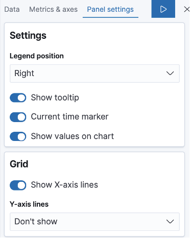
- Legend and Grid
Add more details to your chart with a tooltip, time marker and value of each instance.
-
-
Threshold line
-
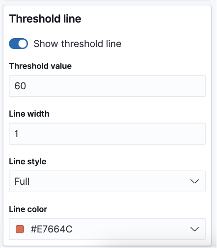
Set a threshold line to notice unusual trends. You can set a threshold value and format the line with width, style (solid, dash or dot) and colour.
Step 3: Save the visualization
- Click Save on the top right corner.
- Add title and description to the visualization for later use.

Tip: You can easily switch between bar, line and area chart type in the visualization builder.
Comments
0 comments
Please sign in to leave a comment.