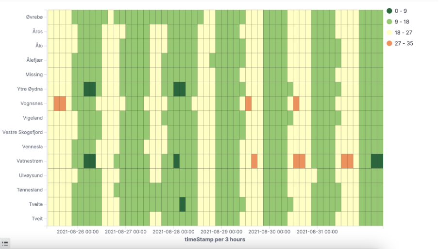
A heat map that shows the magnitude of a phenomenon as colour in two dimensions.
Prerequisites
To work with visualizations, make sure to
- Authorized access to the Klink lab
- Select the right tenant
Table of contents
Step 1: Open the visualization builder
Step 2: Choose Metrics and Buckets for the visualization
Step 3: Save the visualization
Instructions
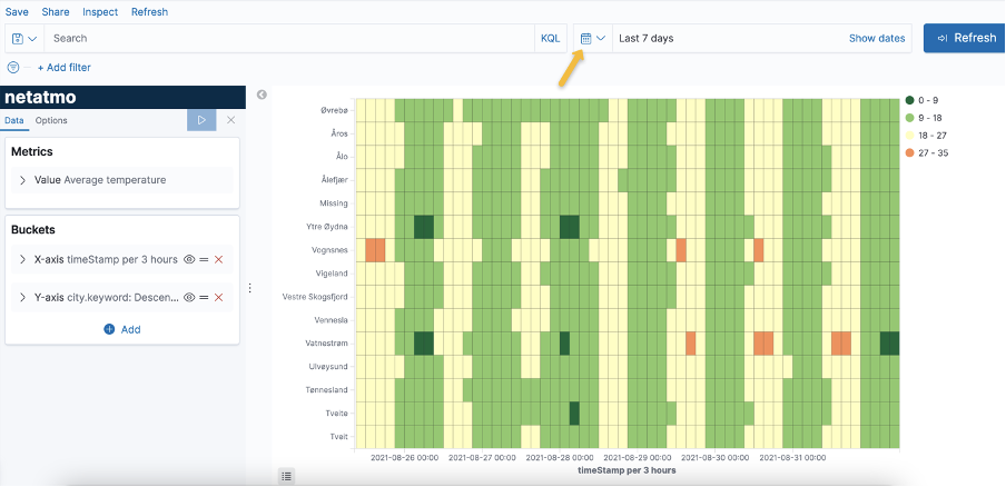
Start with the scenario: Average temperature measured across 15 cities. In this example, we use a public data feed NETATMO
Step 1: Open the visualization builder
- Go to Visualize on the left sidebar menu
- Click Create visualization
- Select Heatmap
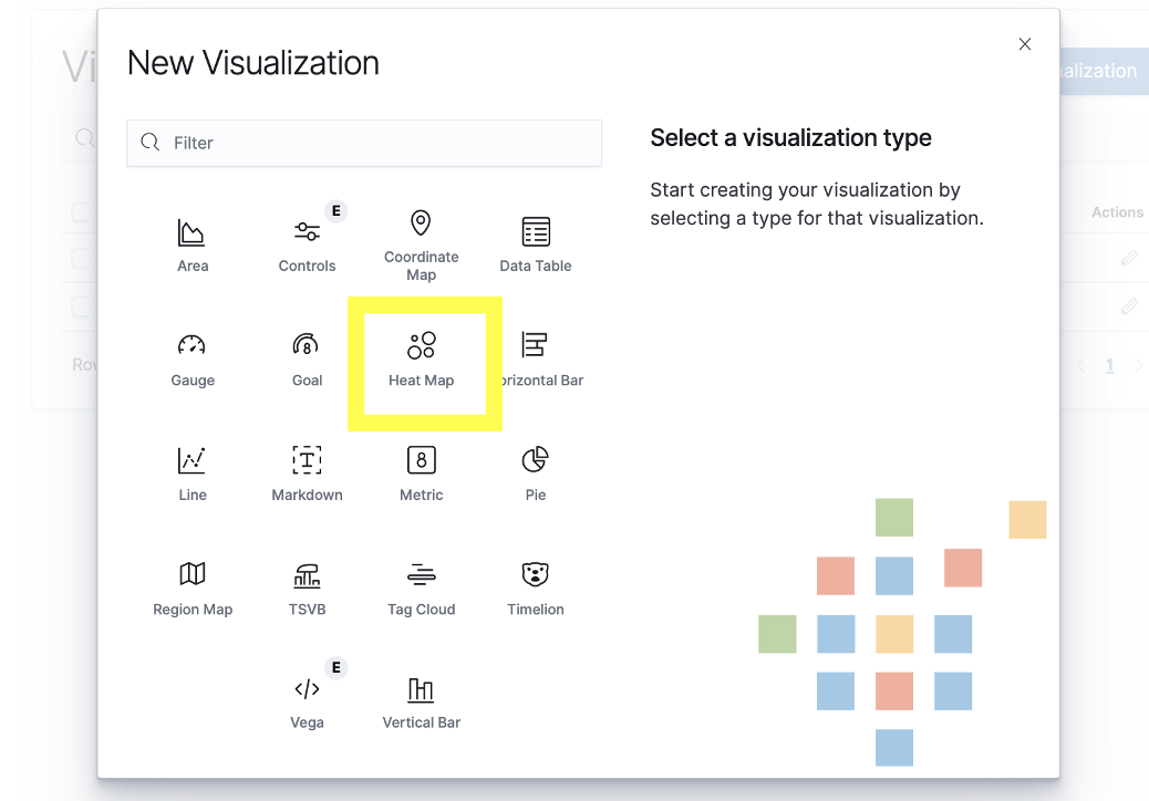
- Select Netatmo as the data source
Step 2: Choose Metrics and Buckets for the visualization
- Learn more about Metric and Bucket Aggregations
Data
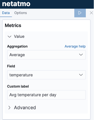
In a heatmap, the colour is determined by the metrics aggregation.
1. Add colours for values
In Metrics panel, set Aggregation to Average, Field to temperature
2. Add X-axis
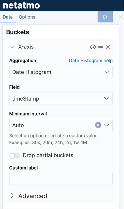
- In Buckets panel, click Add, select X-axis
- Select Date Histogram as aggregation, timeStamp as field, Auto as Minimum interval
3. Add Y-axis
- In Buckets panel, click Add, select Y-axis
- Select Terms as sub aggregation, city.keyword as Field
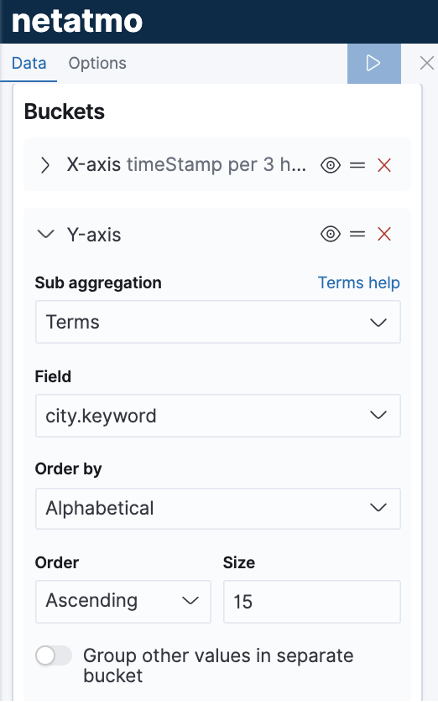
4. Apply change by clicking the arrow icon
Change the time frame to the Last 7 days to see the result.
Options
Basic settings
- Legend position to set the legend located on top/right/left/bottom of the heatmap
- Show tooltip to turn on or turn off the tooltip when mouse over the chart.
Heatmap settings
- Change colour scheme
- Change individual colour
- Change number of colours
- Change colour range
Step 3: Save the visualization
- Click Save on the top right corner.
- Add title and description to the visualization for later use.

Comments
0 comments
Please sign in to leave a comment.